

Dashboard
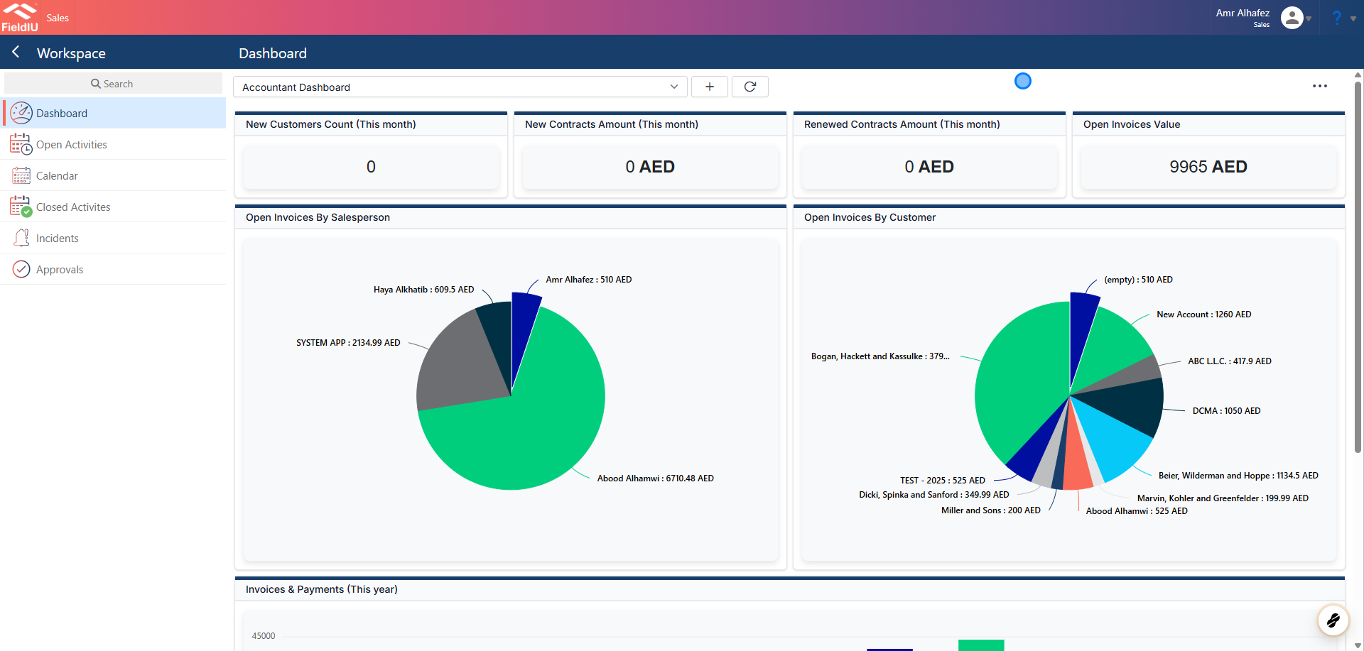
Each application includes a Dashboard Screen that helps you monitor all the records you need.
By default, every application comes with a main dashboard .
Additionally, you can create custom dashboards with your own panels. You can keep these dashboards private or choose to share them with other users.
1. Dashboard Main Screen
2. Dashboard Tool Panel
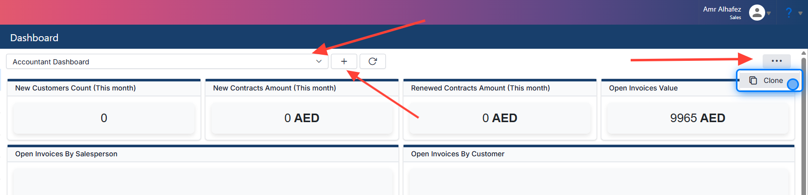
In the main panel tools, you have a dashboard selector to choose between dashboards, a Clone button to duplicate an existing dashboard, and a Create New button to make a new one.
Creating New Dashboard
3. Create Dashboard
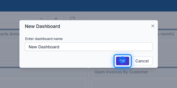
When you click the Create New button, a popup will appear prompting you to enter a name for the new dashboard.
4. New Dashboard Panels
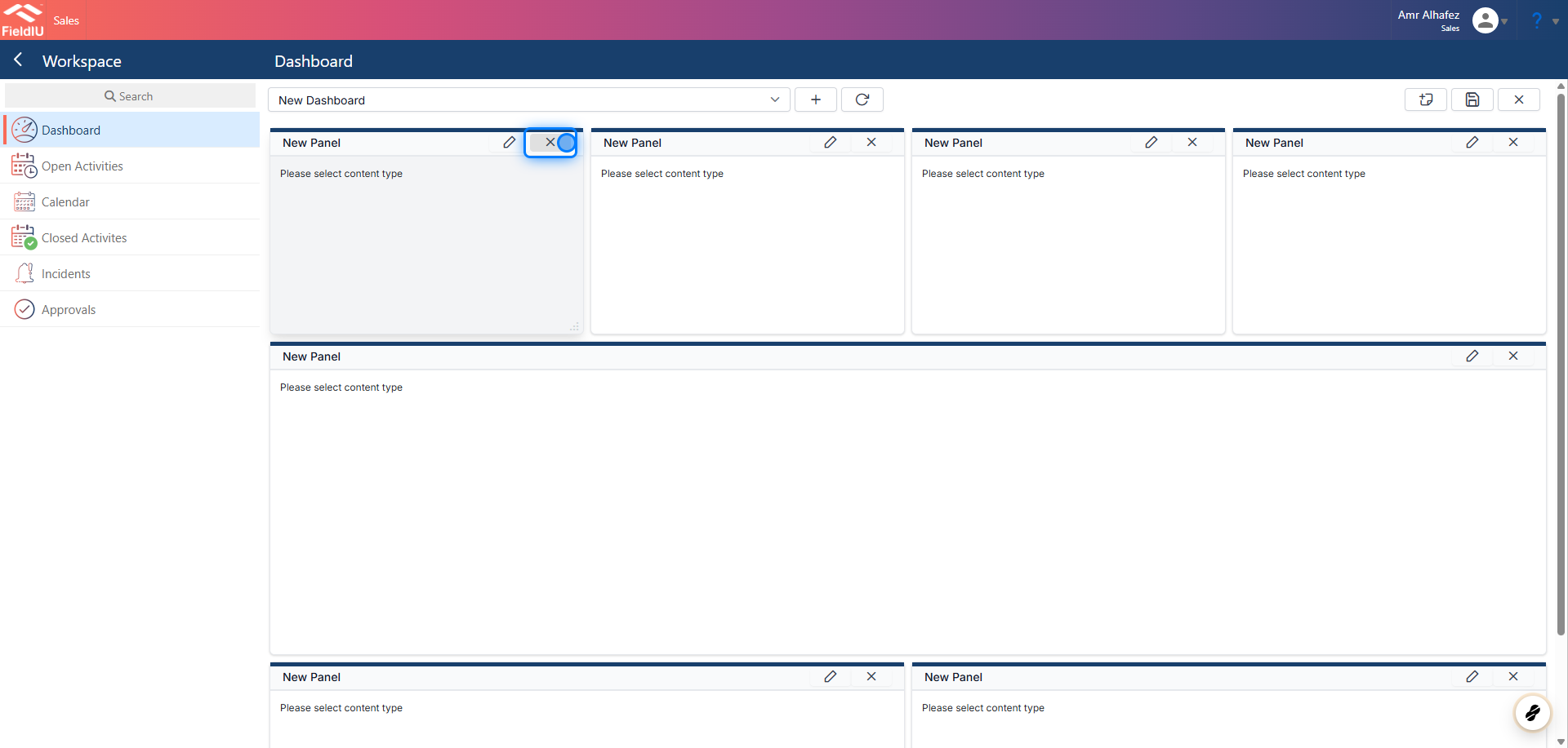
Once the new dashboard opens, you will see empty panels that you can edit to add charts or tables.
💡 Control The Panels
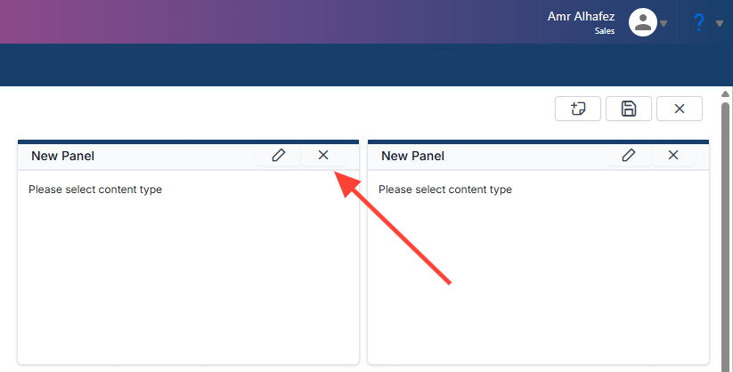
5. Delete Panel
Click the X button to delete a panel.
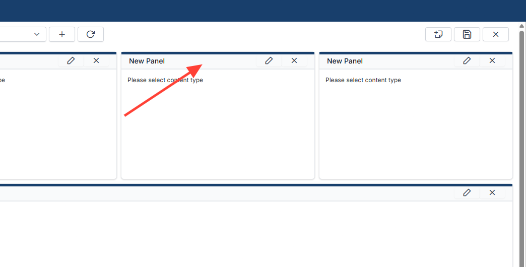
6. Move Panel
You can move a panel by dragging it from its center to the desired area.
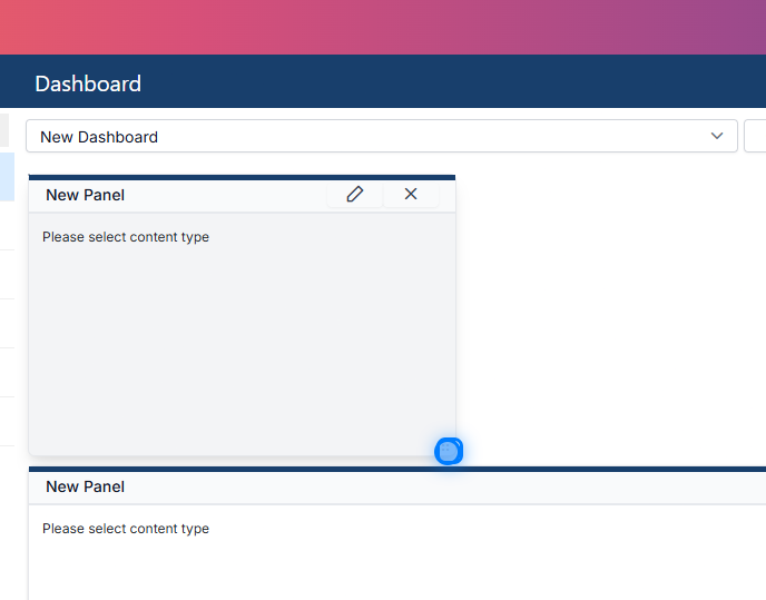
7. Resize the panel
You can resize a panel by dragging it from one of its corners to the desired size.
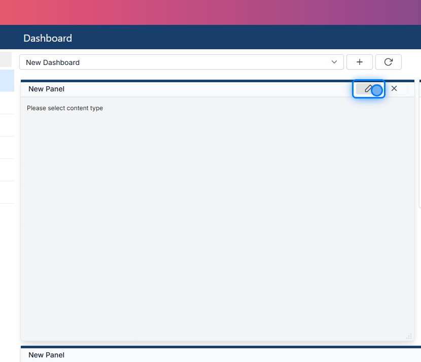
8. Edit Panel
You can edit a panel by clicking the Edit button located in the top-right corner.
Panel Settings
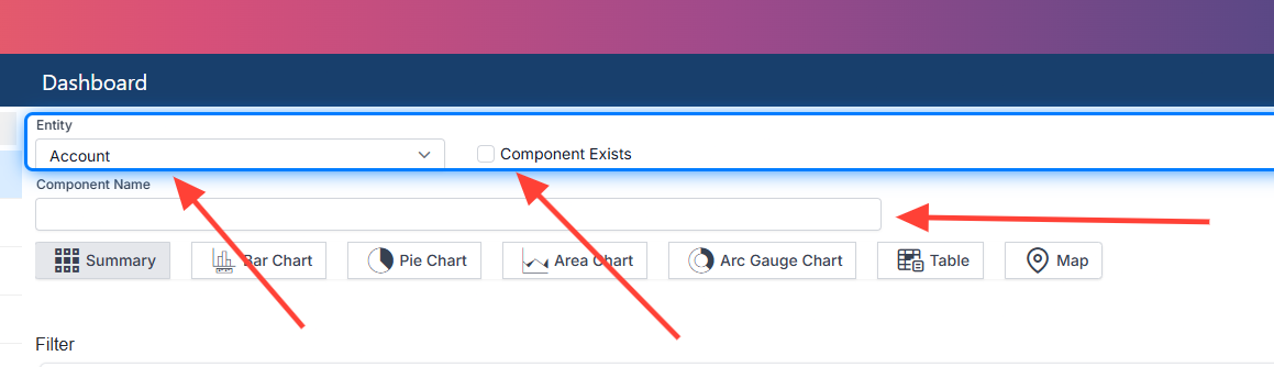
9. Main Settings
When editing a panel, you can configure the following settings:
-
Entity : Select the data source (entity) from which you want to retrieve data.
-
Panel Name : Specify a name for the panel component.
-
Use Existing Component : Choose whether to use an existing built-in component from the system. You can then modify it as needed.
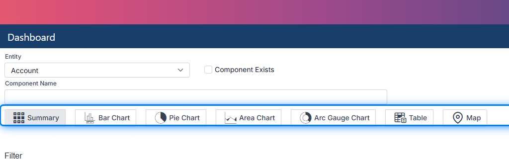
10. Chart Style
In this section, you can choose the style of chart to display your data. Available chart types include:
-
Summary Chart : Displays total values and count numbers.
-
Bar Chart
-
Pie Chart
-
Area Chart
-
Arc Gauge Chart
-
Table
-
Map : Note that data is not displayed in edit mode.
💡 Example
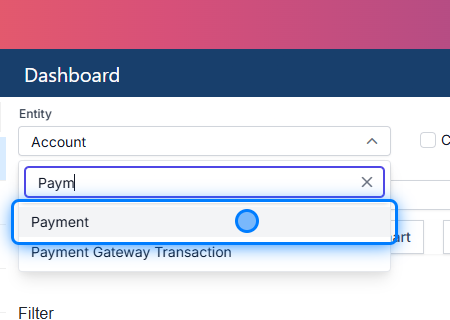
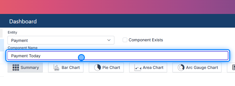
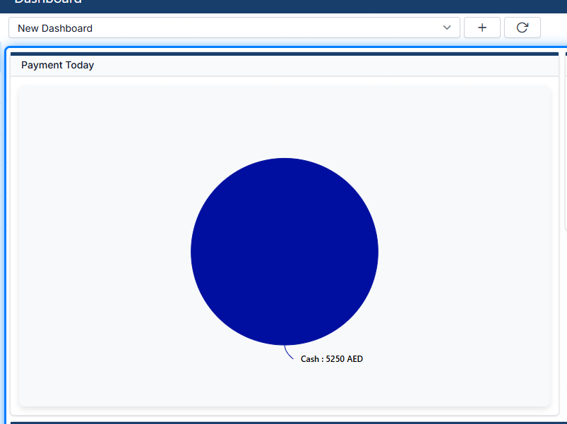
Let’s walk through an example: Displaying payments made today, categorized by payment type . Here’s how you can set it up:
11. Select The Entity
12. Naming the Component
13. Select Chart
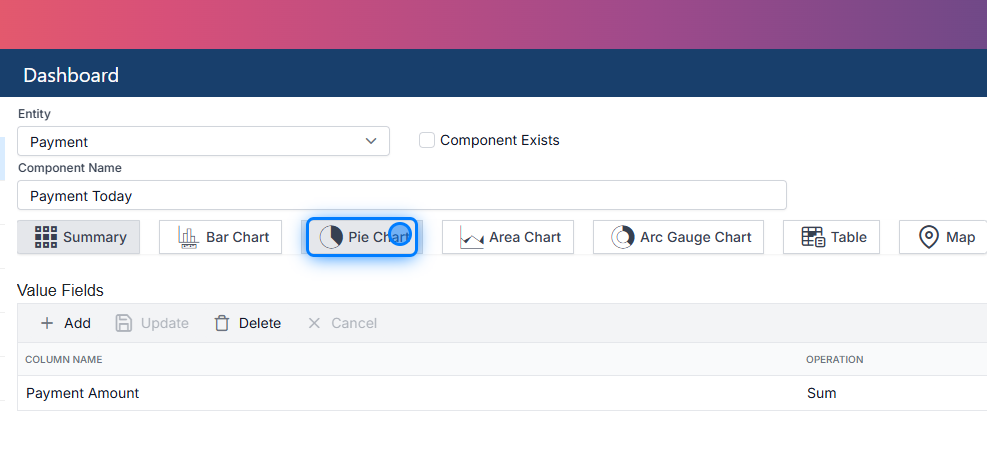
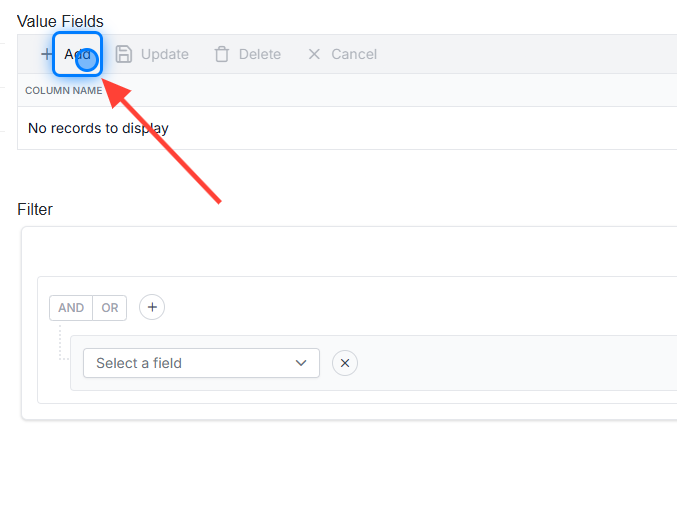
14. Select Value Field
Click On Add
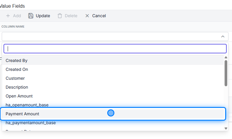
15. Select Field
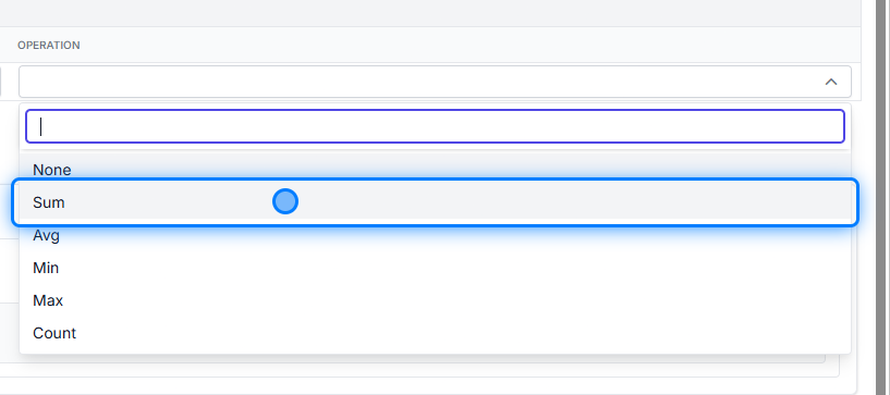
16. Select the Operation
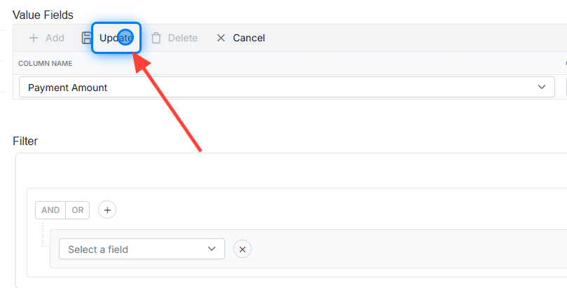
17. Update
It is important to update the Value Fields section.
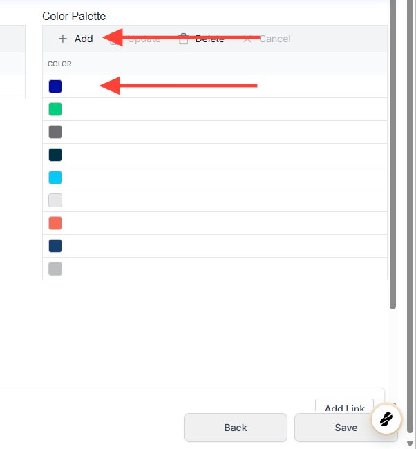
18. Select Your Colors
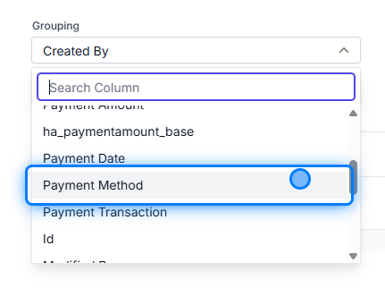
19. Select Grouping
💡 What Happening Here ?
In the Grouping Section , you need to select how the data will be grouped. In our example, we choose the Payment Amount as the value field and set the operation to Sum since we want to sum the total payment amounts.
For grouping, we select Payment Method to categorize the payments based on their method.
20. Entire The Filter
Select the Filter base Field
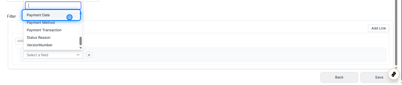
21. Select the operator
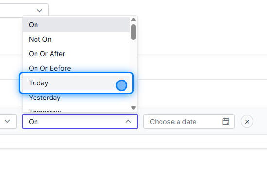
22. Click on Save
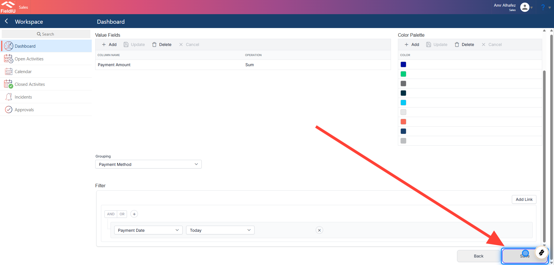
23. The Result
Bar Chart
24. Bar Chart Setup
Let's create an example for the bar chart.
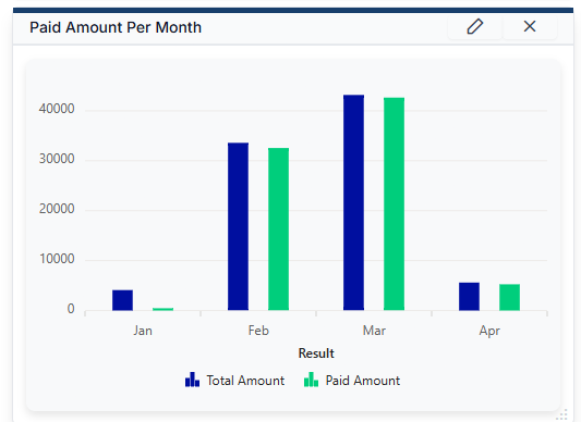
we'll set up the data to sum 'Total Amounts' and 'Paid Amounts' as bars for the current year.
We have selected the entity, named the component, and chosen the Bar Chart.
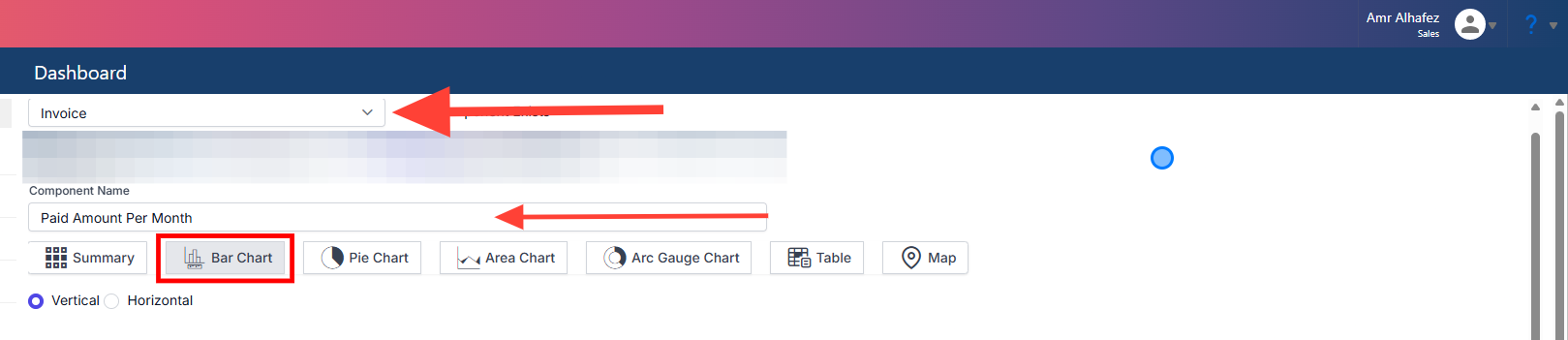
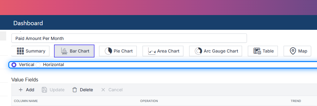
25. Vertical Or Horizontal
You can choose whether the bars are vertical or horizontal.
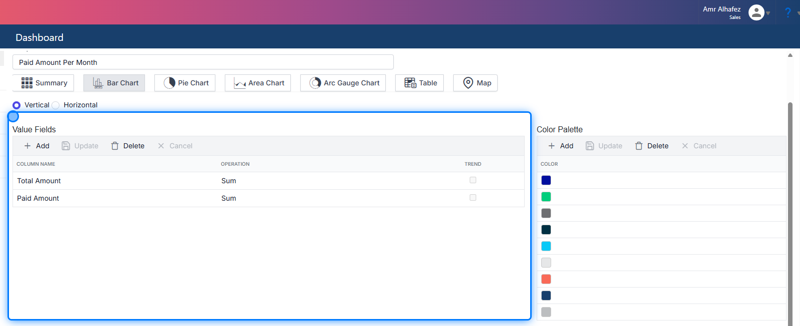
26. Value Fields
I have set up the value fields according to my needs. In this example, I want the sum of 'Total Amount' as one bar and the sum of 'Paid Amounts' as another bar.
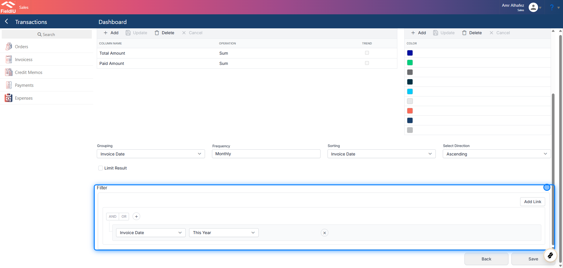
27. Grouping
As we can see, the grouping settings for the bar chart are different. We have options for sorting and direction. Additionally, since the grouping field contains a date, a frequency selector is also available.

28. Limit Results
The 'Limit Results' checkbox allows us to restrict the number of results displayed. However, we will not use it in this example.

29. Setting the Filleter
30. Result
Summury
💡 Example
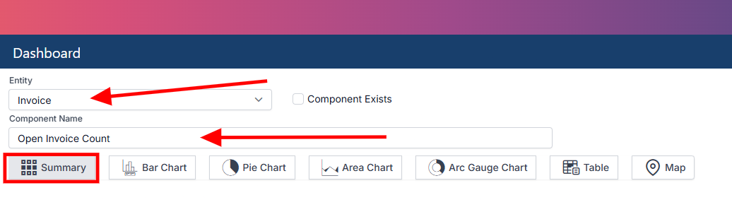
We will create a panel for open invoices.
31. Summary Setup
Let's configure the main settings.
32. Value Fields
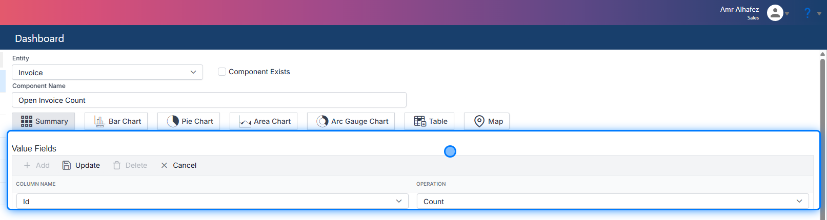
I will select the value field as a count, since I want to count all the invoices. It's best to use the 'ID' field for this purpose.
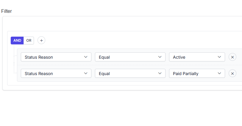
33. Add your filters
34. Resault

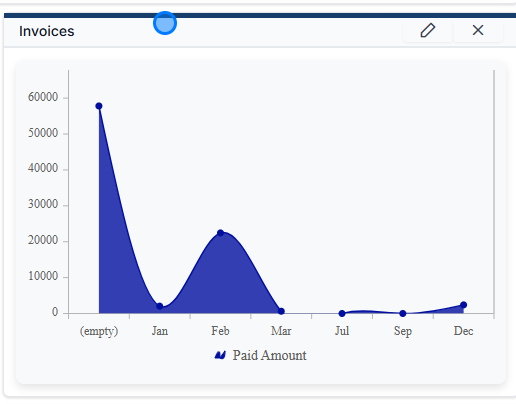
Area Chart
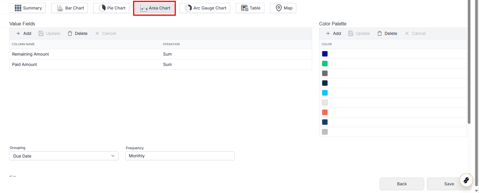
35. Area Chart
36. Result
Arc Gauge Chart
37. Arc Gauge Chart Setup
In the Arc Gauge Chart, we have different setup options:
-
Actual Value vs. Percentage Value
Choose whether the value is a number or a percentage. -
Gauge Stages
Configure the stage values for the gauge. By default, 0 and 100 are defined. -
Value Field
Select the field you want to calculate and display in the gauge.
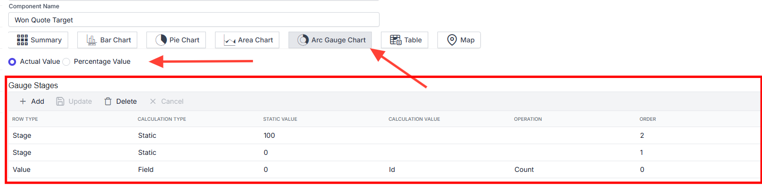
38. Range Setup
This section allows you to define the value ranges for the chart.

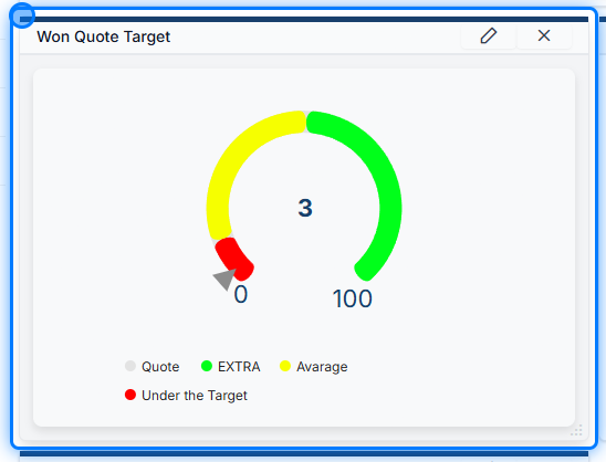
39. Add your Filter

40. Result
Table
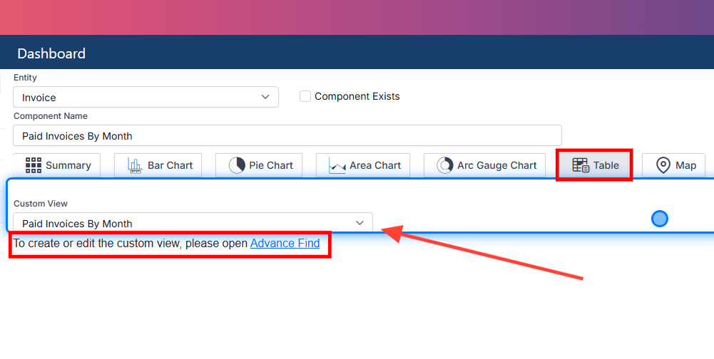
⚠️ You need to create the table view using Advanced Find.
41. Table Setup
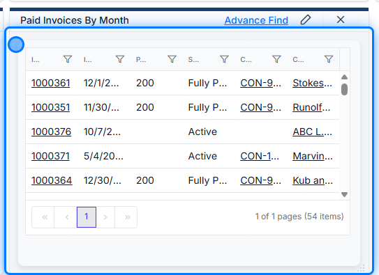
To set up the table, simply select the entity and choose the view you created in Advanced Find.
42. Result
Maps
⚠️ This Work On Entity that Have Coordinates Fields Only
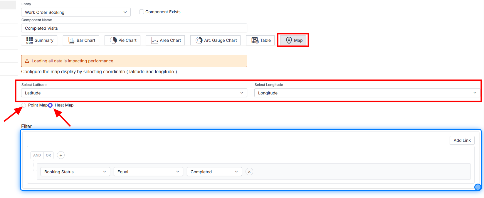
43. Map Setup
Select the entity that contains coordinates.
Insert the Longitude and Latitude fields into their respective selectors.
Choose whether you want a Point Map or a Heat Map.
Finally, select your filters.
💡 All charts are interactive
You can click on any chart to view its corresponding results in a table format.
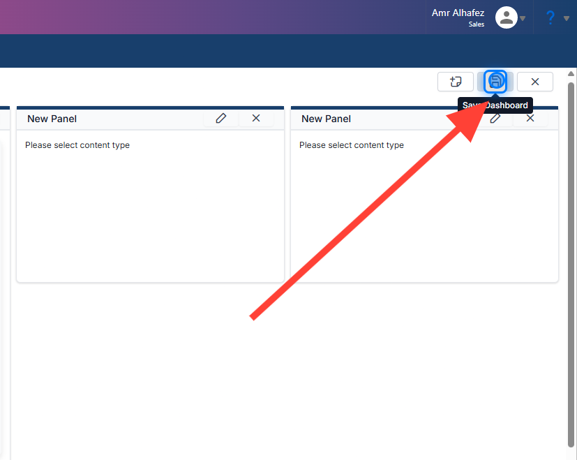
44. Save The Dashboard
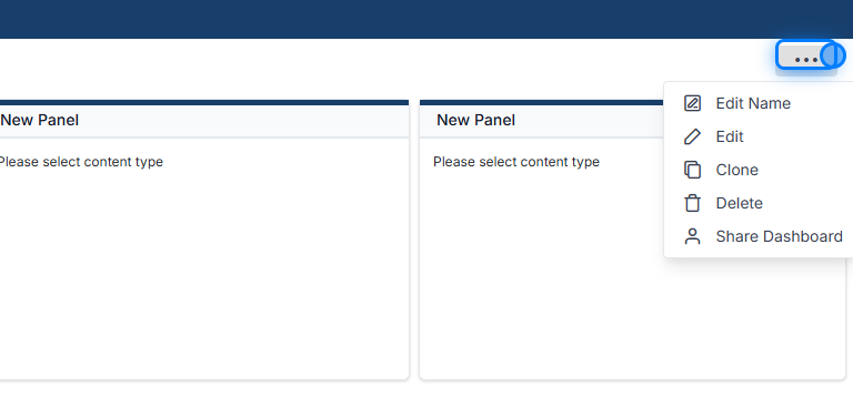
45. Your Dashboard Option
Once you save your dashboard, you will have the following options:
-
Edit Dashboard Name
-
Edit the Dashboard
-
Clone the Dashboard
-
Delete the Dashboard
-
Share the Dashboard
 �����������������������